Multikart React Theme
Welcome to Multikart React!
We are pleased that you have chosen MULTIKART React theme for your site and we will not disappoint you with your choice. MultiKart is an excellent theme develop with a concise approach. The code written is a clean and well structured.
MultiKart is the most powerful & responsive theme with all the modules and functions involved with an attractive design.
MultiKart theme template is build focusing on HTML and CSS3 and works perfectly fine in all the browsers.
Multikart theme include 16 inner pages, 10 product pages, and 3 shop pages.
We request to have a look at our MultiKart manual to know brief about the theme! We have compromised each and every detail for you in the manual that you will need.
If we are unable to answer your queries beyond our documentation, you are free to contact us through the themeforest support page with your site. We will be happy to cater you and will get back to you in no time.
Read the manual before jumping to start!
Theme Features
- Next.js : Theme is completly convert in Next.js so it will easy to use server side rendering as well SEO
- GraphQL Supported : We integrated graphQL here so it will easy to integrate your API.
- Responsive Design : Looks great on desktops, laptops, tablets and mobiles. Give it a try on your iPhone or iPad now.
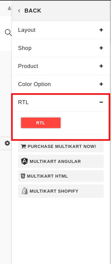
- RTL Supported : All inner pages of Multikart are RTL supported.
- Made with Sass : Multikart is made with sass.
- W3 Validator : This theme coded with beautiful and clean codes! Some powerful HTML files 100% valid W3 web standards.
- Bootstrap 4 : Multikart made by boostrap latest version.
- Google Font : You can use unlimited Google fonts.
- Product Hover Variation : This theme has 4 product hover variations
- React Slick Carousel : We have use for slider.
- React Toastr : We have use for Nofication.
- Add to Cart : When click on add to cart button, product added in cart page and also display on header cart .
- Quick-view : Every product has Quick view modal popup.
- Wishlist : Click on wishlist button, product added in wishlist.
- Product Compare : Click on Compare button product added in compare list , maximum 4 product allow to add.
- Product Details : Every Product have individual details page and 10+ different product pages, and you can any use details page.
- One Page Checkout : In product details page added buy now it's re-direct checkout page with selected product.
- Shop Page : We have added 3 different shop pages, and you can any use shop page.
- Filter : 3 Different type of custom filter (tag, color, size) it's customizable, you can customize by your logic.
- Payment Method : We have added two payment method paypal and stripe.js for checkout.
- Blog Page : There three different blog variation pages.
- Inner Page : Multikart theme include 16 inner pages.
- Multi-Browser Support : Multikart has multi browser support.
Folder Structure
When you unpack downloaded archive from ThemeForest.net you'll get folder containing 4 folders.
- Documentation - Documentation for Multikart React site template
- Frontend - Multikart Next Frontend Template with All demo
- API - Dummy backend for getting fast data in frontend
- Backend - Multikart React Backend Admin panel template
- Email-template - Different Email templates in html
Next Folder Structure
- components //All component of theme you can find from here
- common //All common component of theme you can find from here
- constant // Constant file for Language changer you can find from here
- containers //Cart container
- customizer //Customizer UI and their related config
- footers
- headers
- shop // Common layout for other page will call from here
- config
- index.jsonAdd your firebase credential here
- helpers //Controller part of theme will call from here
- apollo
- cart
- Compare
- Currency
- filter
- menu
- theme-setting
- wishlist
- pages //Your complete theme page will call from here
- api
- blogs
- layouts All demos you can find from here
- page
- portfolio
- product-details
- shop
- public
- assets
- fonts
- images
- scss
- video
- favicon.ico
- assets
- service
- index.js
- script.js
Start Building
Prerequisite
Install Node.js and NPM : Download Node.js from https://nodejs.org/en/download/ and install it on your system. NPM comes bundled with Node.jsTheme
When you extract file from download you will find following folder:
- Theme
- Graphql
- Backend
- EmailTemplate
- Documentation
For Start working with runnning your frontend you need to follow below step:
- Extract API folder as well as Theme folder
- Then run Api project first by doing:
- npm i
- npm start
- Now it's a time to run your frontend to see theme from which your dreams comes true
- npm i
- npm run dev
- Once your frontend runs successfully you can see it in http://localhost:3000
now your Api port is running fine. You can check it out in url which provided in terminal
Note: For getting data in frontend (in your all demos) you must need to run this api first.
SCSS
- All Theme design related SCSS you can find from /public/assets/scss/theme
- _style.scss (Complete theme scss you can find from here)
- _responsive.scss (Responsive of complete theme scss you can find from here)
- _variable.scss (All Common variable of complete theme you can find from here)
- _dark.scss (for Dark mode of theme)
- _rtl.scss (RTL of complete theme scss you can find from here)
- _menu.scss (for menu of theme)
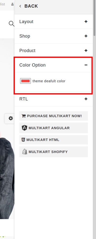
Unlimited Color
- Yes, You read correct!! we are here with unlimited color option. To change the color of complete theme you need do following:
:root {

                        --theme-deafult: #e6e224;

                    }
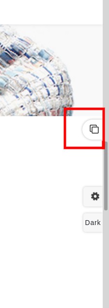
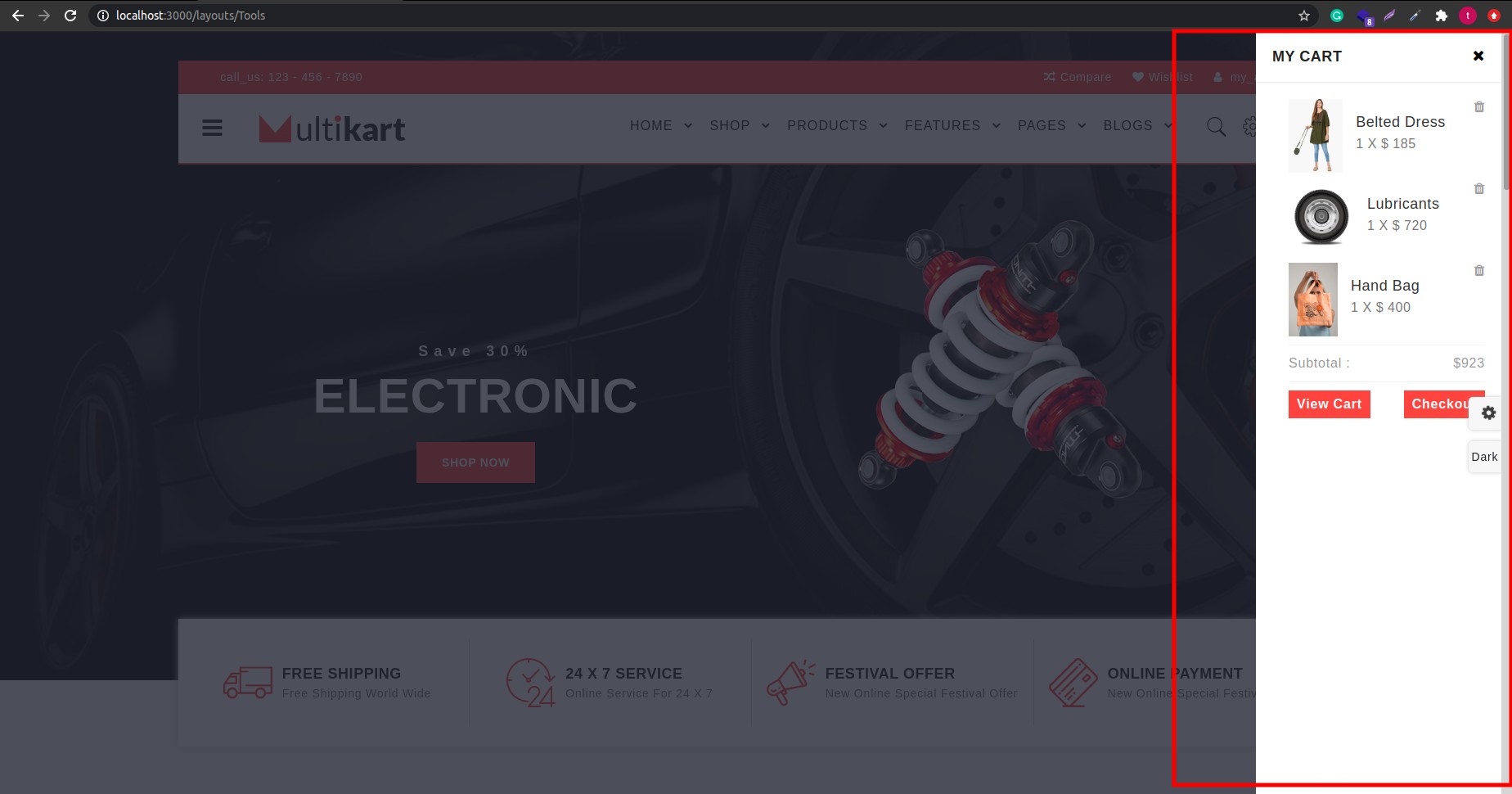
Customizer
You can customise your theme using customiser
To change the LTR mode to RTL or Change color from any unlimited color then you can just select the option from customiser as attached in below screenshot
Now to change in your project you just need to copy that config from attached image and paste in config.json in /components/customizer/config.json
Theme
Now Multikart having multiple demo you can have more benefit with that as you can take a design of productbox, cart, as well as header and footer
Product box
- With the name product box we mean following:
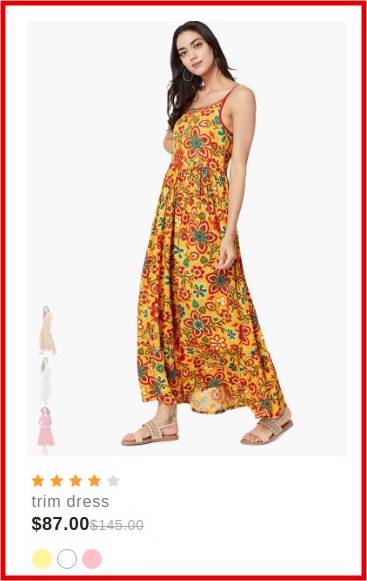
- Now if you want to change product box of fashion demo to electronic demo or wise-versa.
- You just need to go to particular demo from pages >> layouts >> index.js and then find the code of prodcut box by counting section from top of demo or just find by component
- Once you get that component you can just replace with productbox of your demo.
- Also you can directly see different style of productbox in /components/common/product-box
- Or if you want complete section then you can fingd from /components/common/Collections
Add to Cart
- With the name Add to cart we mean following:
- On the Right side of header we have cart icon on click of that icon some demo have drop down and some demo open modal from any one corner of page i.e. from top, bottom, left, right
- So now if you want to use that cart design in your demo you just need to add direction props in cart component just like we have used in header-one, header-two, header-five,header-six
Header and Footer
- Now if you like header or footer of other demo rather then demo which you like then you cab select that particular lines of import statement from demo you like and put it in your demo, and you have header and footer of your choice with you.
Removal of demos
Now it's bit easy to remove demos from theme
Suppose if you don't want other demo except demo which you like then just do below steps:
- Remove all layouts from pages >> layouts except the one which you like
- Remove all other components from component >> common >> collection except you imported in your demo
- Remove other productbox from component >> common >> product-box except which you import in your upper collection component
- Also you can remove all extra pages as per your requiremet
Note: Same component import statement you need remove from other menus like shop, products, features etc.. as per you received an error in your console.
Removal/ Change Loader
Suppose if you want to remove /change the loader which you can see in page load that you can change from:
- Go to _app.js where you can find code for loader at starting of remplates you can just remove that to remove a loader.
- Now suppose if you want to change design of that loader you need to take that class and find it in scss and change scss as per your requirement
GraphQL
We have use GraphQL for integrating data to frontend
Backend
- You can open graphql backend from out of your main theme folder, there is one folder called API.
- Open that folder in that we have created some mock.json like for all product we have complete json in api >> src >> product >> data.js
- If you want same design & data as per our theme you need to have json response as per ours in above mentioned file.
- Now suppose you don't want same data response as per we displayed in frontend, then you need to make mendatory chages in above js as well as in frontend graphql query in your collection component which is in components >> common >> collections
Frontend
- Before running frontend you compulsary need to run api first as we are getting all dynamic data from api
- We are connecting backend from frontend in next.config.js
- Now for getting data from api we has written query in that particular component
- So now if you want to change in your json you need to change query according to that in component
- and you have runnable project with you
Skeleton Loader
- We have put skeleton loader in product box, and that loader component you can find from components/common/Loader.js
- Now if you want to change design of that skeleton loader you need to change the data in that, according to design which you want.
- Well, you can see skeleton loader in product box by not running api from backend
Firebase
Basically Firebase use for:
- Email and password authentication with Firebase,
- Social authentication with Facebook and Google, Twitter etc..
- Manage Complete Database on Cloud
- Hosting
- Password recovery,
- Verification emails,
- Storing and accessing the authentication state using the browser's localStorage
There are also many other use of firebase that you can find from reference which we have attach below.
Prerequisites
You must have the following prerequisites:
- Recent versions of Node.js and NPM. You can install them from their official website,
- React Cli installed (npm install -g create-react-app)
Let's follow below step to secure your application
-
Step 1:
-
1.setup firebase project in firebase console.
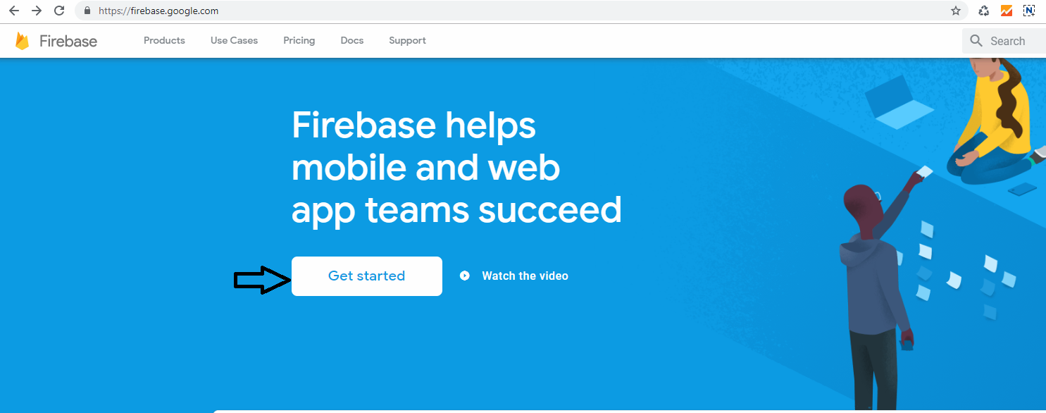
click on Get Started button
-
2. Add new project
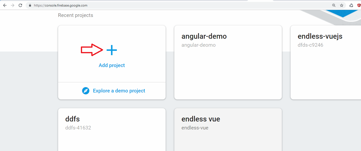
create new project
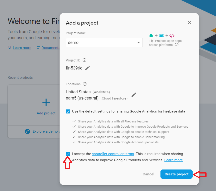
Accept the controler-terms and click on Create Project
-
3. Go to Develop > Authentication
-
4. Get config object for your web app
To get the config object for a Firebase Web App:
>> Click the Settings icon, then select Project settings.
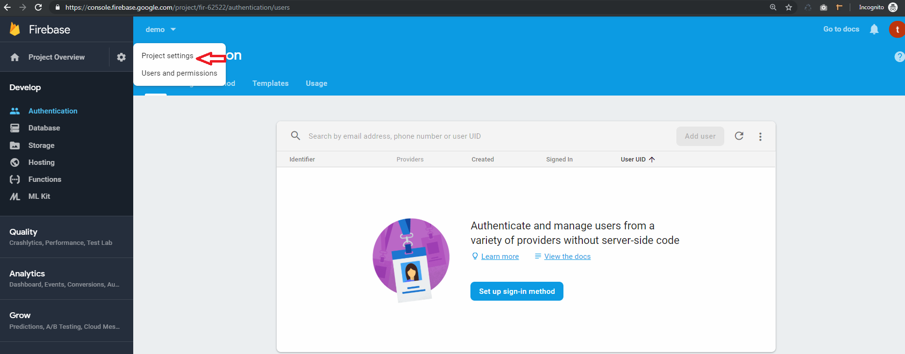
>> Go to the web app
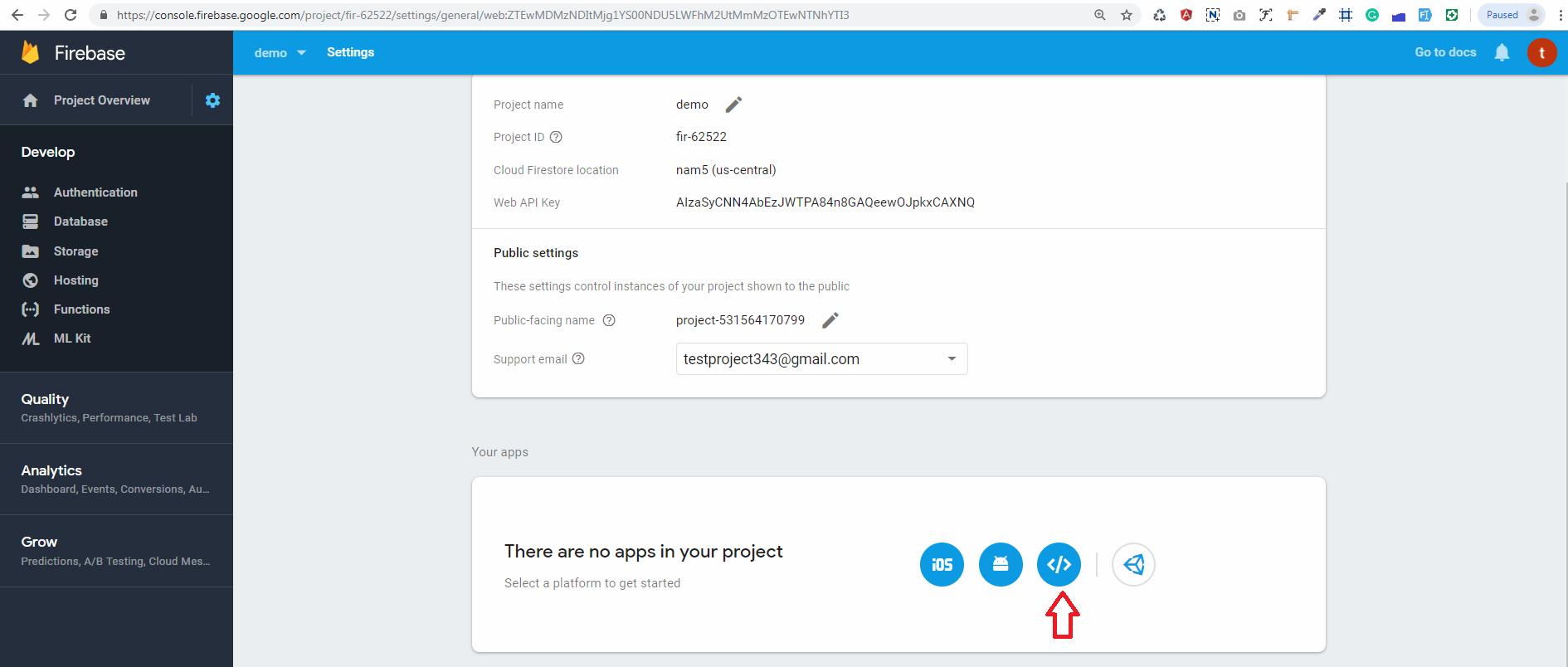
>> In Your apps card, select the nickname of the app for which you need a config object.
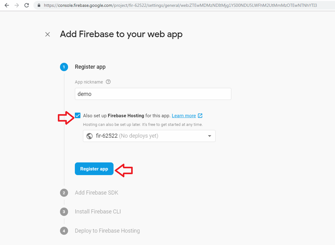
>> Select Config from the Firebase SDK snippet pane.
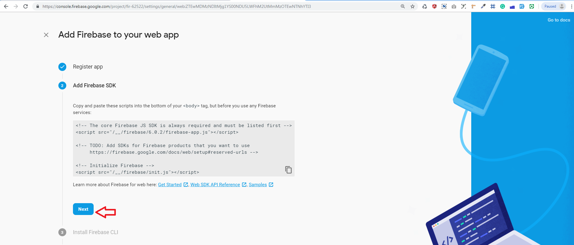
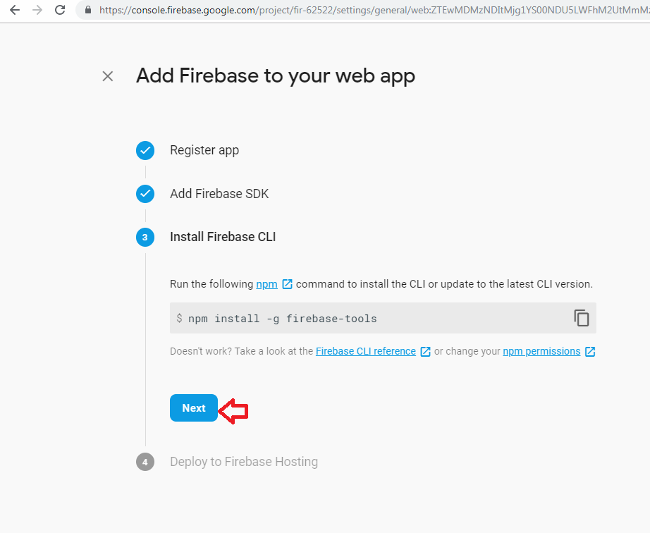
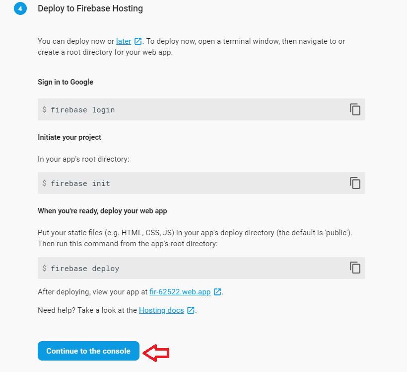
>> Copy the config object snippet, then add it to your app's HTML.
copy config add on config.txt
-
5.Next, you'll need to enable Email authentication from the authentication > Sign-in method tab:
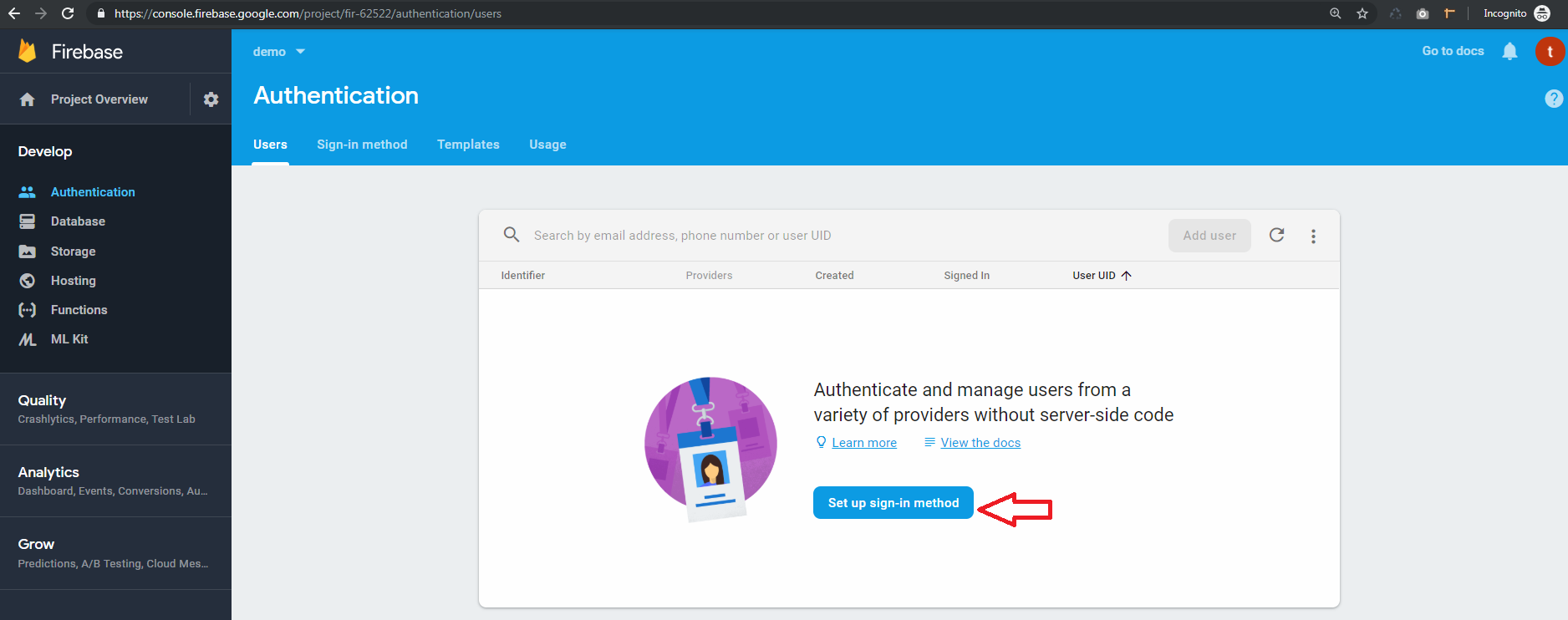
-
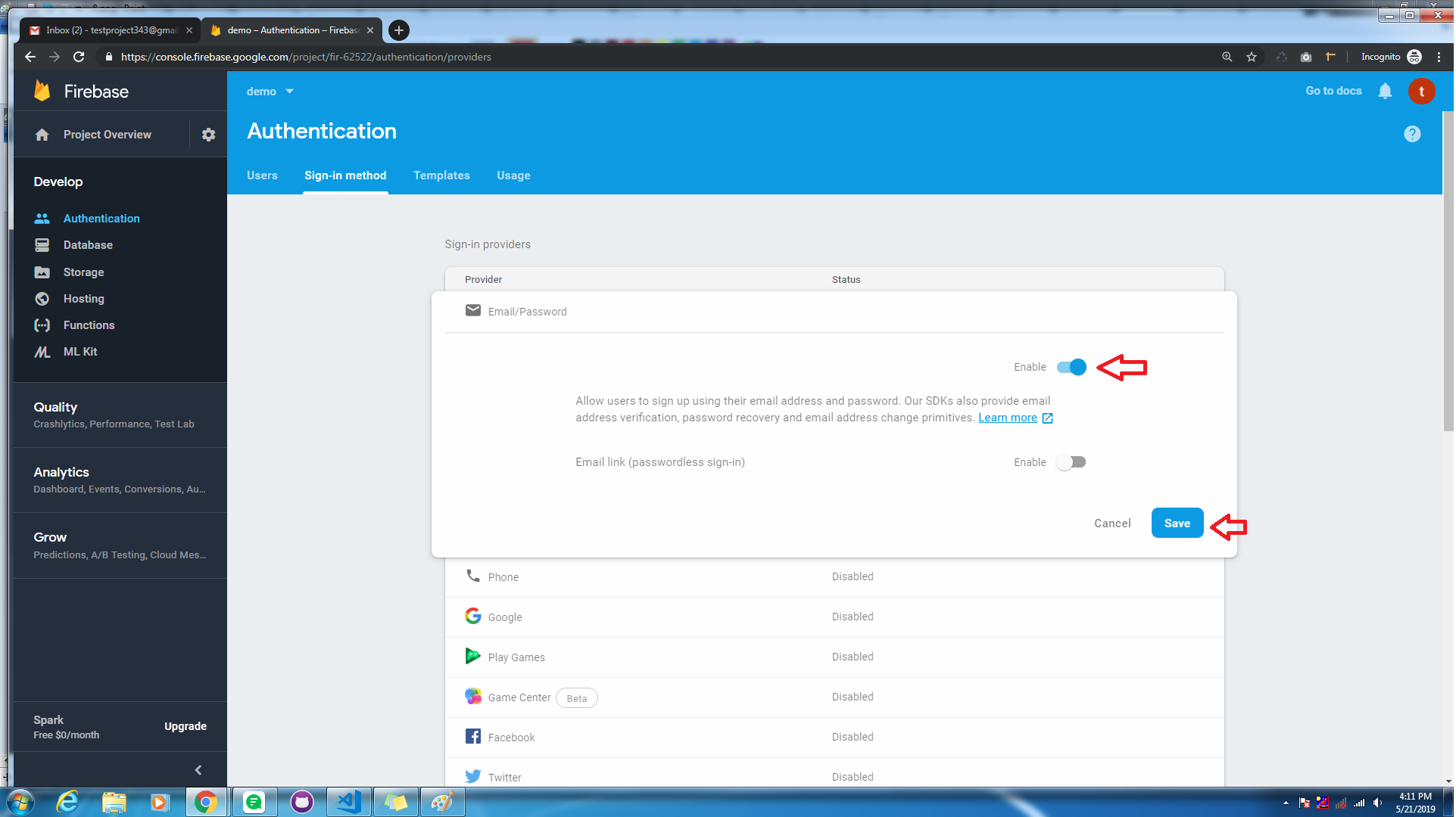
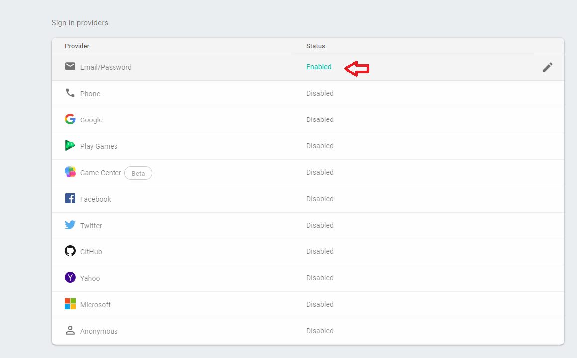
6.go to sign in method
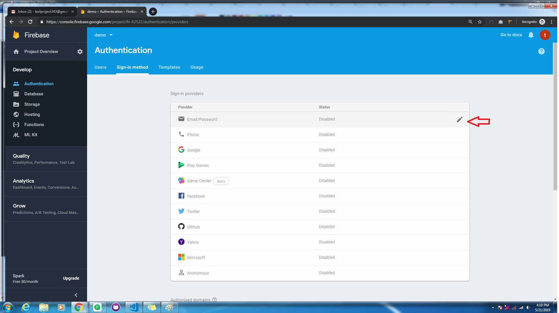
Make disble toggle to enable, and save changes
-
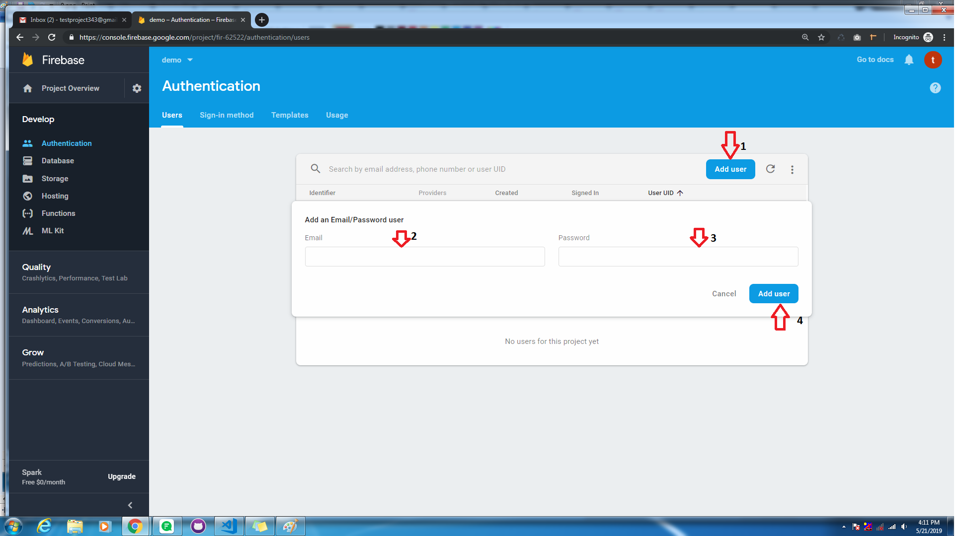
7.Go to the authentication > Users tab then click on the Add user button and genarate email and password:
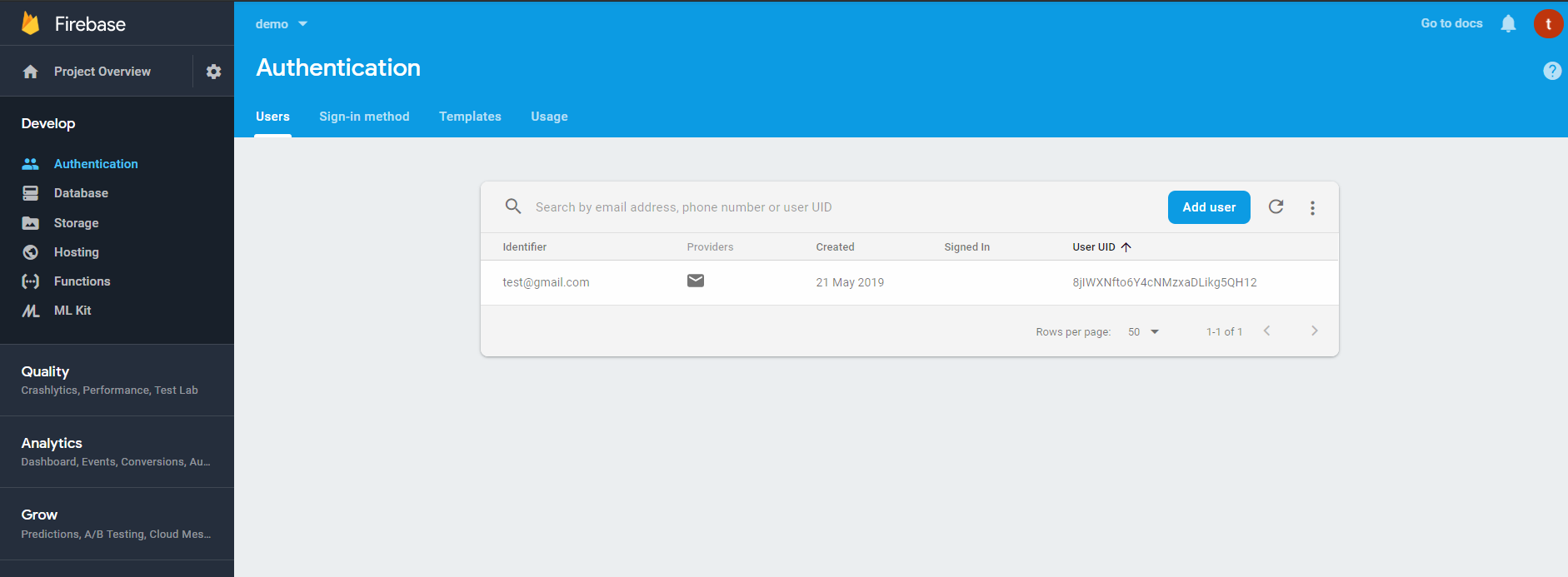
-
-
Step 2:
Installing Firebase in React
-
npm install ——save firebase -
2. Here .env file. Add your firebase credential for using Endless with firebase and restart your app. Don't change defined variables.
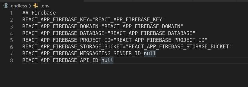
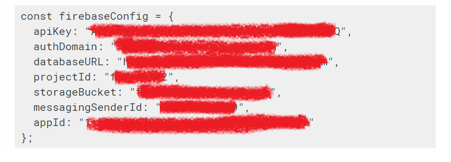
This config file manage inside the src >> data >> base.js folder
import * as firebase from "firebase/app"; import 'firebase/firestore'; import "firebase/auth"; const app = firebase.initializeApp({ apiKey: process.env.REACT_APP_FIREBASE_KEY, authDomain: process.env.REACT_APP_FIREBASE_DOMAIN, databaseURL: process.env.REACT_APP_FIREBASE_DATABASE, projectId: process.env.REACT_APP_FIREBASE_PROJECT_ID, storageBucket: process.env.REACT_APP_FIREBASE_STORAGE_BUCKET, messagingSenderId: process.env.REACT_APP_FIREBASE_MESSAGEING_SENDER_ID, appId:process.env.REACT_APP_FIREBASE_API_ID }); -
3. Generate components in auth folder called Login and Register and use firebase in Login and Register component according to your needs.
- Navigate to API folder
- Now run below command
-
After deploying the api you will get the api endpoint url. Now go to frontend and Put that url in
- 1) next.config.js in which you have API url under env object put your endpoint in that API url
- 2) and in webpack.confog.js there is one key called target in proxy object set your endpoint in that string in below format.
- Now navigate to command prompt in frontend make it live by running below command
- Apollo : To integrate graphql in theme : Doc: https://www.npmjs.com/package/bootstrap
- Firebase : To integrate Login functionality : Doc: https://www.npmjs.com/package/bootstrap
- i18 : To Translate your thought : Doc: https://www.npmjs.com/package/bootstrap
- Bootstrap : Doc: https://www.npmjs.com/package/bootstrap
- redux : Doc: https://www.npmjs.com/package/redux
- react-slick : Doc: https://www.npmjs.com/package/react-slick
- react-infinite-scroll-component : Doc: https://www.npmjs.com/package/react-infinite-scroll-component
- react-toastify : Doc: https://www.npmjs.com/package/react-toastify
- react-input-range : Doc: https://www.npmjs.com/package/react-input-range
- react-paypal-express-checkout : Doc: https://www.npmjs.com/package/react-paypal-express-checkout
Deployment
https://vercel.com/
If you want to make live the template in vercel.com then follow the below command
API
vercel
Shop
NEXT_PUBLIC_GRAPHQL_API_ENDPOINT= '{put_your_api_url_here.}/graphql'vercel
fonts
                        <!--Google font-->
<link href="https://fonts.googleapis.com/css?family=Lato:300,400,700,900" rel="stylesheet">
Dependencies
Thank you
Once again thank you for purchasing one of our Templates , if you like our Templates please rate us
Best Regards, Pixelstrap
-